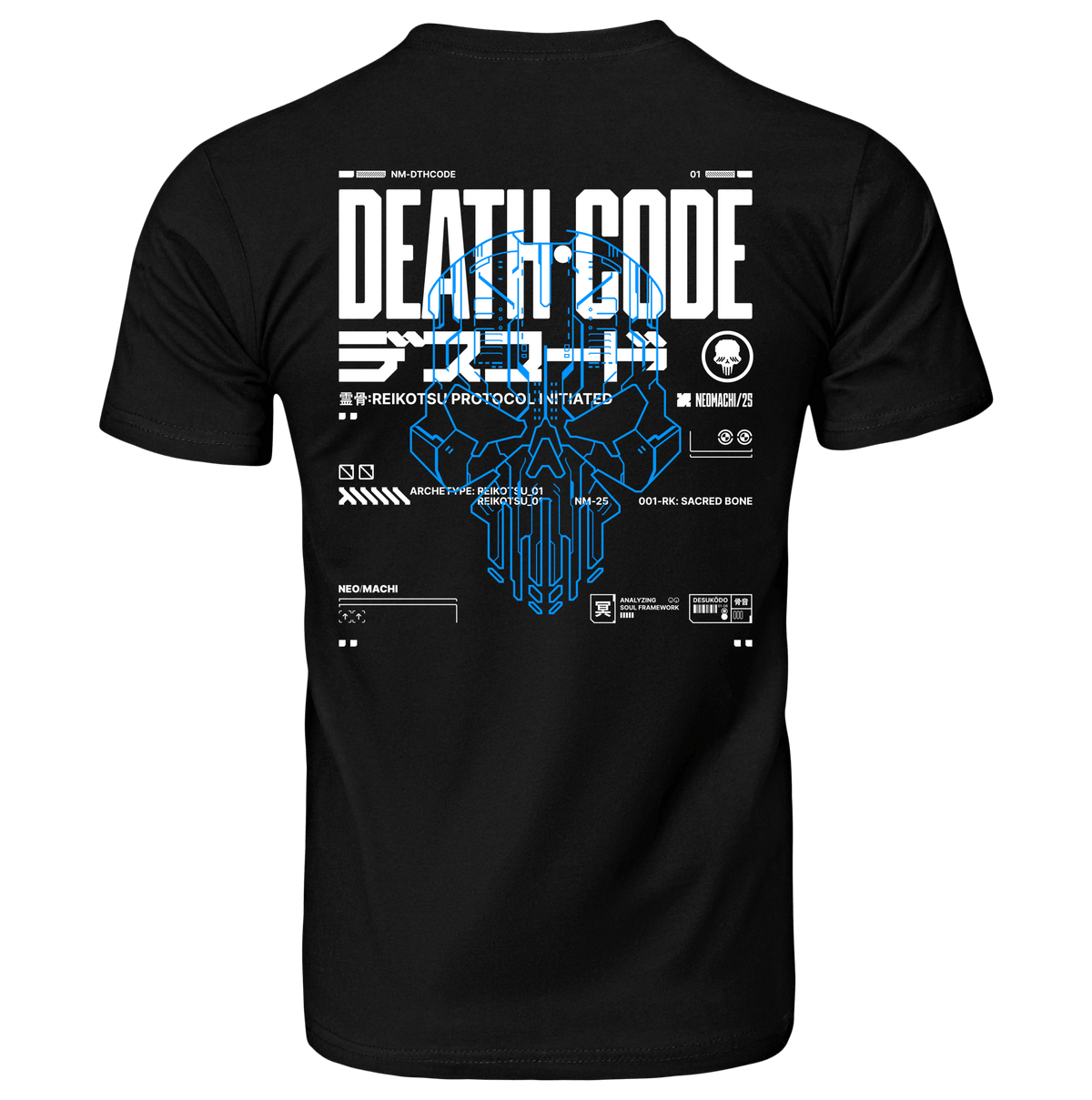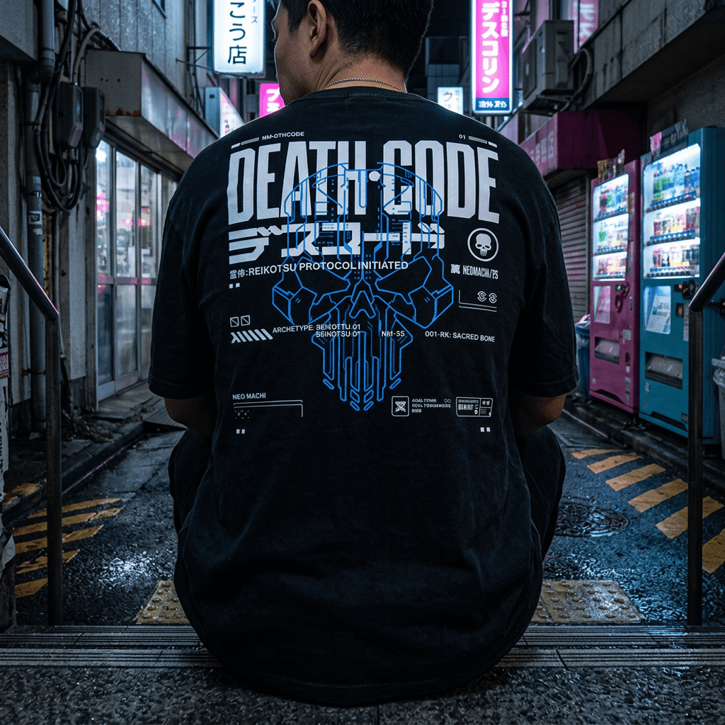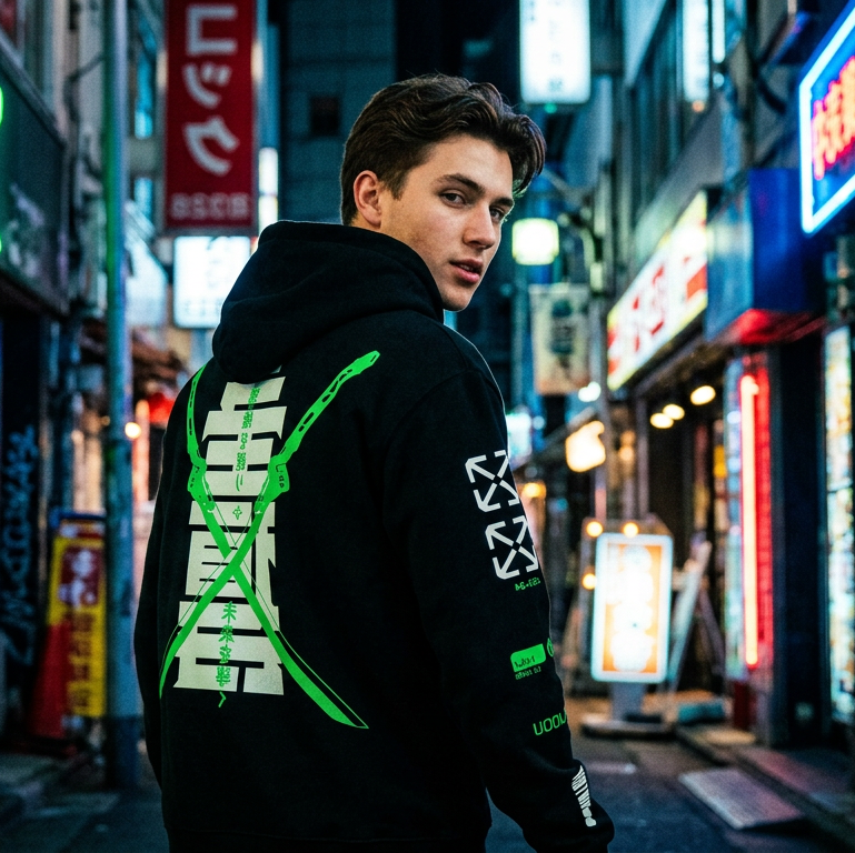
Almost every cyberpunk garment is covered in the same handful of visual elements — angular Japanese text, circuit traces, glitch bands, wireframes, fictional corporate marks. Most people wearing them could not tell you what any of it is supposed to be.
That is worth fixing, partly because it is interesting and partly because it is the fastest way to tell a designed garment from a generated one.
The Japanese text
Japanese uses three writing systems together, and which one appears on a garment tells you something about whether the designer knew what they were doing.
Katakana
The angular one — ア, ノ, ミ, ヲ. Katakana is used in Japanese primarily for loanwords from other languages, foreign names, technical terminology and emphasis.
It dominates cyberpunk design for two reasons. Aesthetically, the forms are sharp, high-contrast and built from straight lines, which sits beautifully next to circuit graphics. Semantically, it is the script used for imported technical vocabulary — so it genuinely is the writing system a Japanese cyberpunk future would use for most of its jargon. It is the right choice, not just the good-looking one.
Kanji
The dense logographic characters borrowed from Chinese — 電, 機, 都. Each carries meaning rather than sound, which makes kanji the most loaded element you can put on a garment and the easiest to get embarrassingly wrong.
A well-chosen kanji is doing real work. A kanji picked purely for its shape is the design equivalent of a tattoo you cannot read. This is the single most common failure in the category.
Hiragana
The rounded, flowing one — あ, の, き. Used for native Japanese grammar. It appears far less in cyberpunk design precisely because it looks soft, which is the opposite of what the aesthetic wants.
Its rarity is diagnostic: a design mixing hiragana into what is meant to be a technical readout is usually a design where nobody checked.
Circuit traces
The right-angled branching lines that look like a printed circuit board, because that is what they are imitating — copper pathways on a PCB, which really do run in right angles and 45-degree diagonals for manufacturing reasons.
They read as "technology" more efficiently than almost any other mark, and they work as texture at any scale. The tell for a lazy version: traces that terminate in nothing, cross each other freely, or curve organically. Real traces connect components and avoid crossing.
Glitch artefacts
Horizontal displacement bands, colour channel separation, blocky corruption. These imitate genuine digital failure modes — specifically what happens when video data is damaged or a signal is lost mid-frame.
The colour separation in particular comes from a real place: when red, green and blue channels desynchronise, you get exactly the cyan-magenta fringing that is now shorthand for the entire aesthetic. It is another reason those two colours are so dominant. More on that in the cyberpunk colour palette.
Glitch works because it implies the image you are looking at is being transmitted rather than printed — that there is a system behind it, and the system is failing.
Wireframes and HUD elements
Low-polygon outlines, targeting reticles, corner brackets, scrolling data columns, radar sweeps.
These come from two sources: early 3D graphics, which could only render outlines, and genuine heads-up displays in aviation. Both are now nostalgic rather than futuristic, which is a large part of their appeal — cyberpunk's idea of the future has always been dated on purpose.
Corner brackets are the most-used and least-noticed element in the whole vocabulary. They imply something is being tracked or selected, which implies an observer, which implies surveillance. A lot of meaning from four small marks.
Fictional corporate marks
The invented logo, the faction badge, the division number.
This is the most narratively important element and the one most brands skip, because it requires actually inventing something rather than decorating. In cyberpunk fiction, corporations are the governing structures — so a garment carrying a corporate mark is a uniform, and a uniform implies you belong to something.
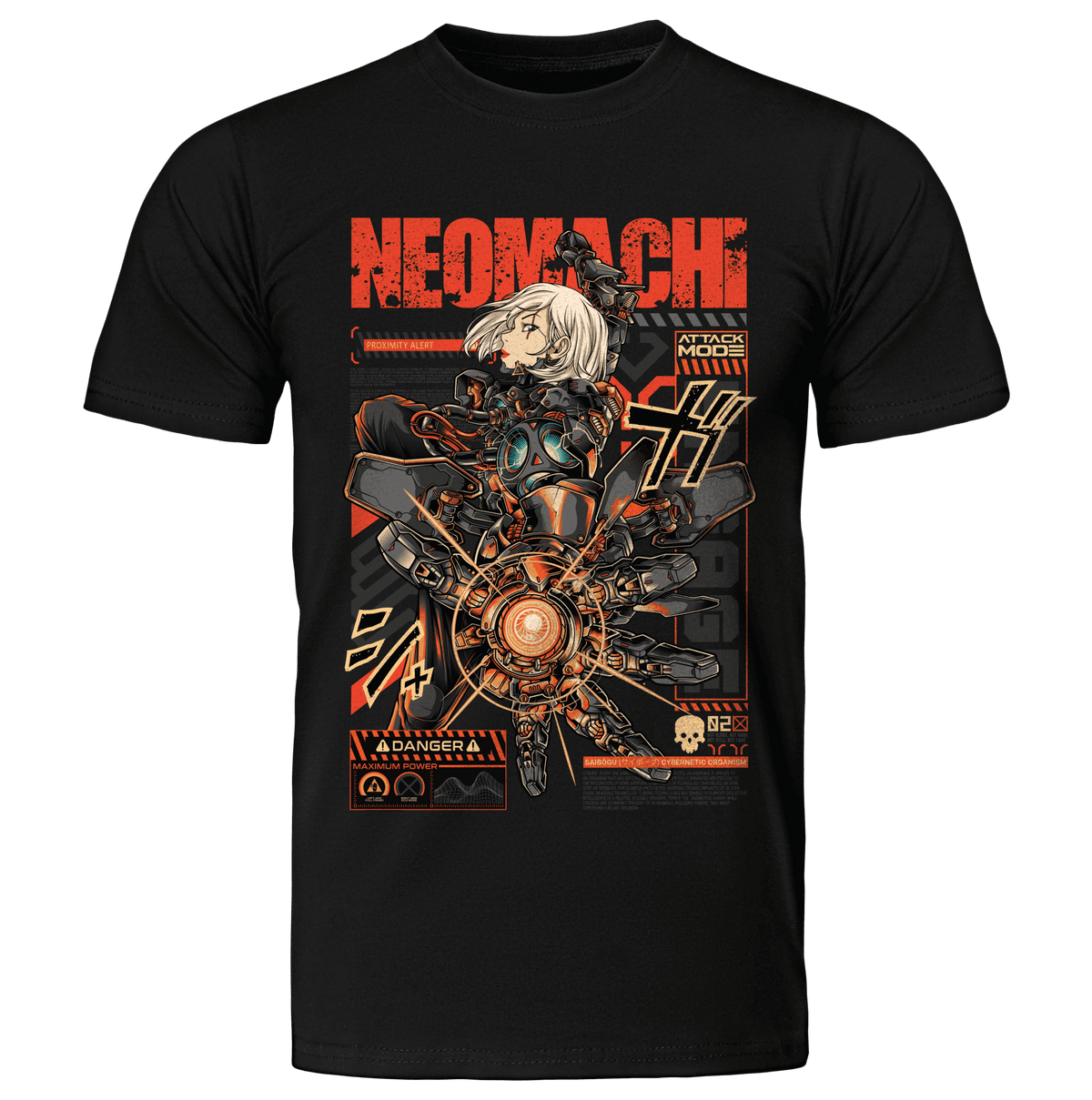
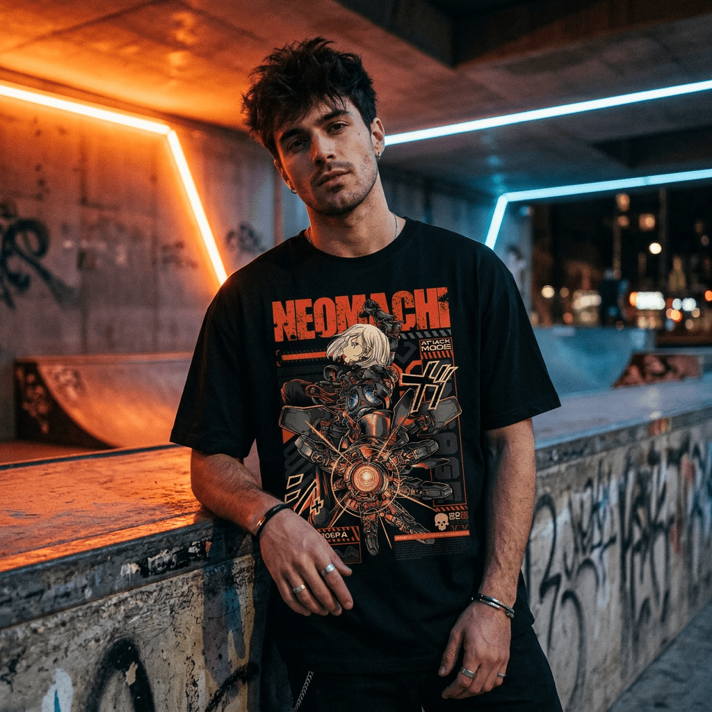
That is the entire reason NEOMACHI designs are built as if they come from somewhere. Neo plus machi (町, town or district) — a new district, with factions and streets inside it. The graphics are meant to read as artefacts from that place rather than as patterns. We wrote about the Japanese roots of that idea in why cyberpunk is so Japanese.
How to read a garment before you buy it
Once you know the vocabulary, quality becomes visible at a glance.
- Is the Japanese text consistent? A technical readout should be katakana, not a mix of all three systems chosen for shape.
- Do the circuit traces connect? Lines that terminate in nothing were drawn as decoration, not as a circuit.
- Does the glitch follow a rule? Real displacement is horizontal and banded. Random noise scattered across the image is a filter.
- Is there a faction or a mark? Something implying the garment came from a place, rather than just being a pattern.
- Zoom in. Generated artwork falls apart at full resolution — text that resembles Japanese without being it, mechanical parts connecting to nothing, symmetry that drifts.
That last one is the fastest test for AI-generated designs, and it pairs with the others in how to spot real cyberpunk brands.
Frequently asked questions
What does the Japanese writing on cyberpunk clothing mean?
It depends entirely on the brand. Designs using katakana for technical terminology are usually deliberate; kanji chosen purely for its shape often means nothing. Ask the brand — one that designs will tell you.
Why is katakana used so much in cyberpunk design?
Two reasons. Its angular, straight-line forms suit technical graphics, and in actual Japanese it is the script used for imported technical vocabulary — which is exactly what a technology-saturated future would be full of.
Is it disrespectful to wear Japanese characters?
Not inherently — the aesthetic grew out of a genuine forty-year exchange between Japanese and Western creators. What matters is whether the text means something or is being used as decorative texture with no thought behind it.
What are the corner brackets on cyberpunk graphics?
Borrowed from HUDs and targeting interfaces. They imply something is being tracked or selected, which is how a flat graphic suggests surveillance in four small marks.
How can I tell if a cyberpunk design is AI-generated?
Zoom to full resolution. Generated work produces text that looks like Japanese without being it, circuit traces that connect to nothing, and details that dissolve under inspection.
Designed, not generated
Every NEOMACHI graphic is drawn by real artists, built from this vocabulary deliberately, and printed in Europe. Zoom in on any of them.
Shop all cyberpunk clothing → | What is cyberpunk clothing? →