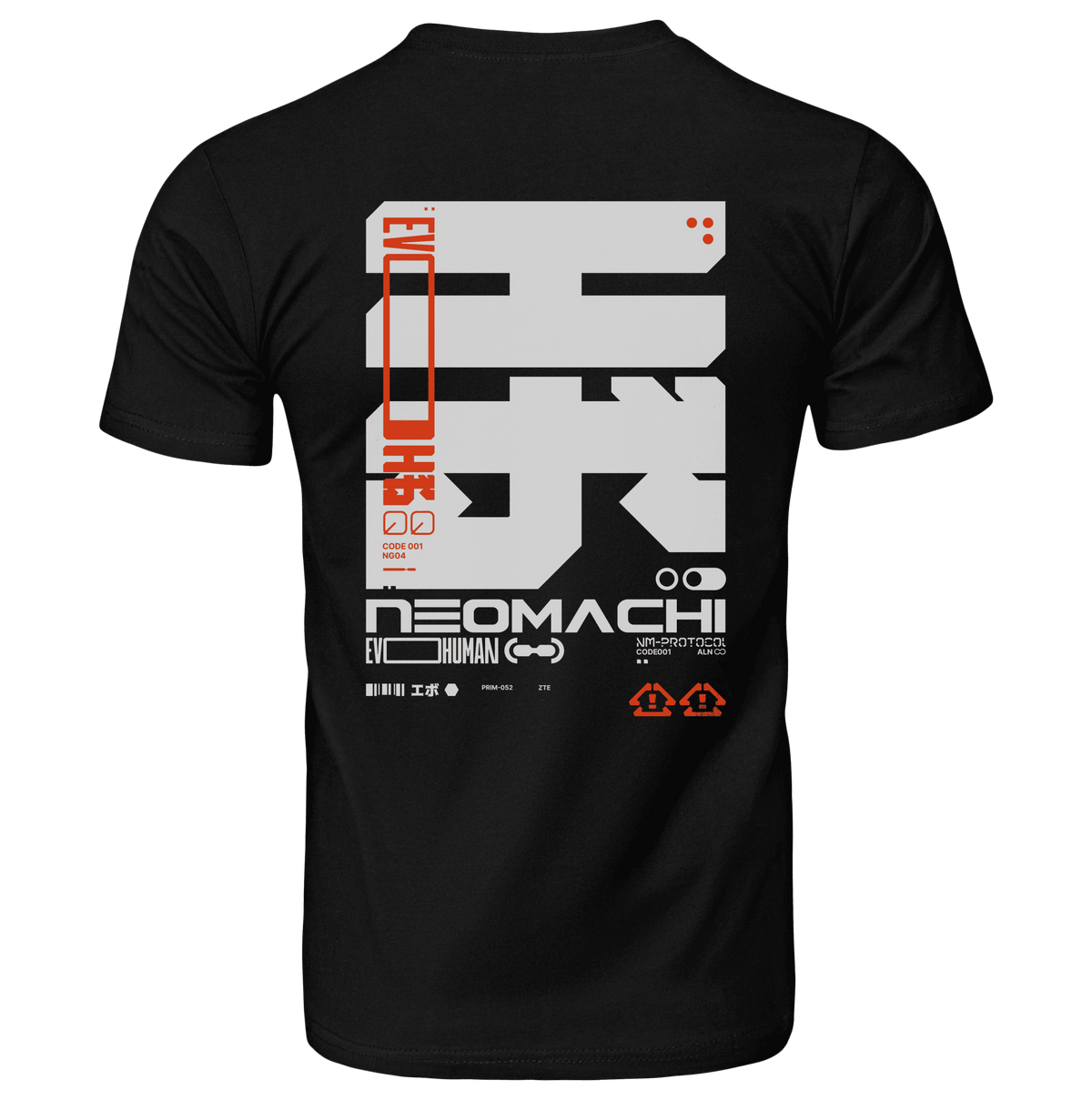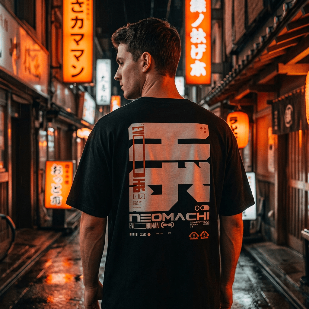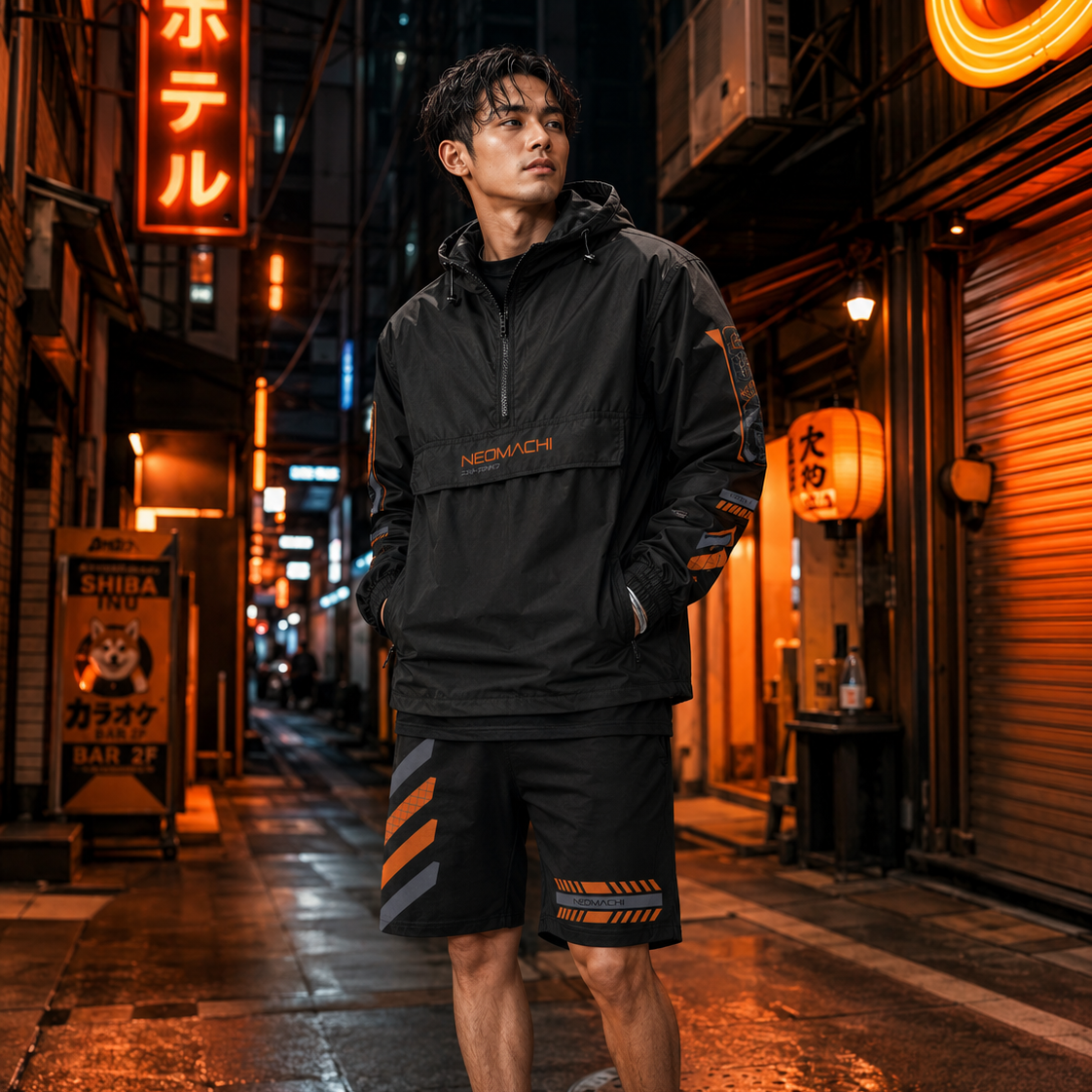
Three aesthetics, all of them about the future, all of them heavy on neon and grids and chrome, and all of them constantly mistaken for each other. The confusion is understandable — they share a decade of source material. But they are pointed in completely different directions, and once you see the difference you cannot unsee it.
The shortest version: cyberpunk is about a future that arrived badly. Vaporwave is about a future that was promised and never came. Y2K is about a future people were briefly, sincerely excited by.
Cyberpunk: the future as a place you live in
Time signature: forward. A city twenty or fifty years from now.
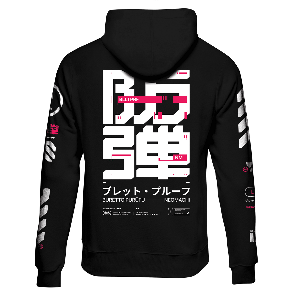
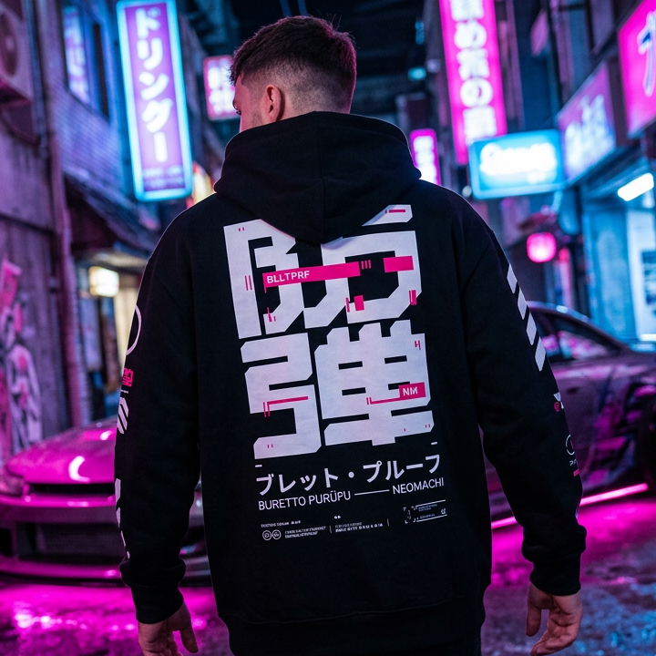
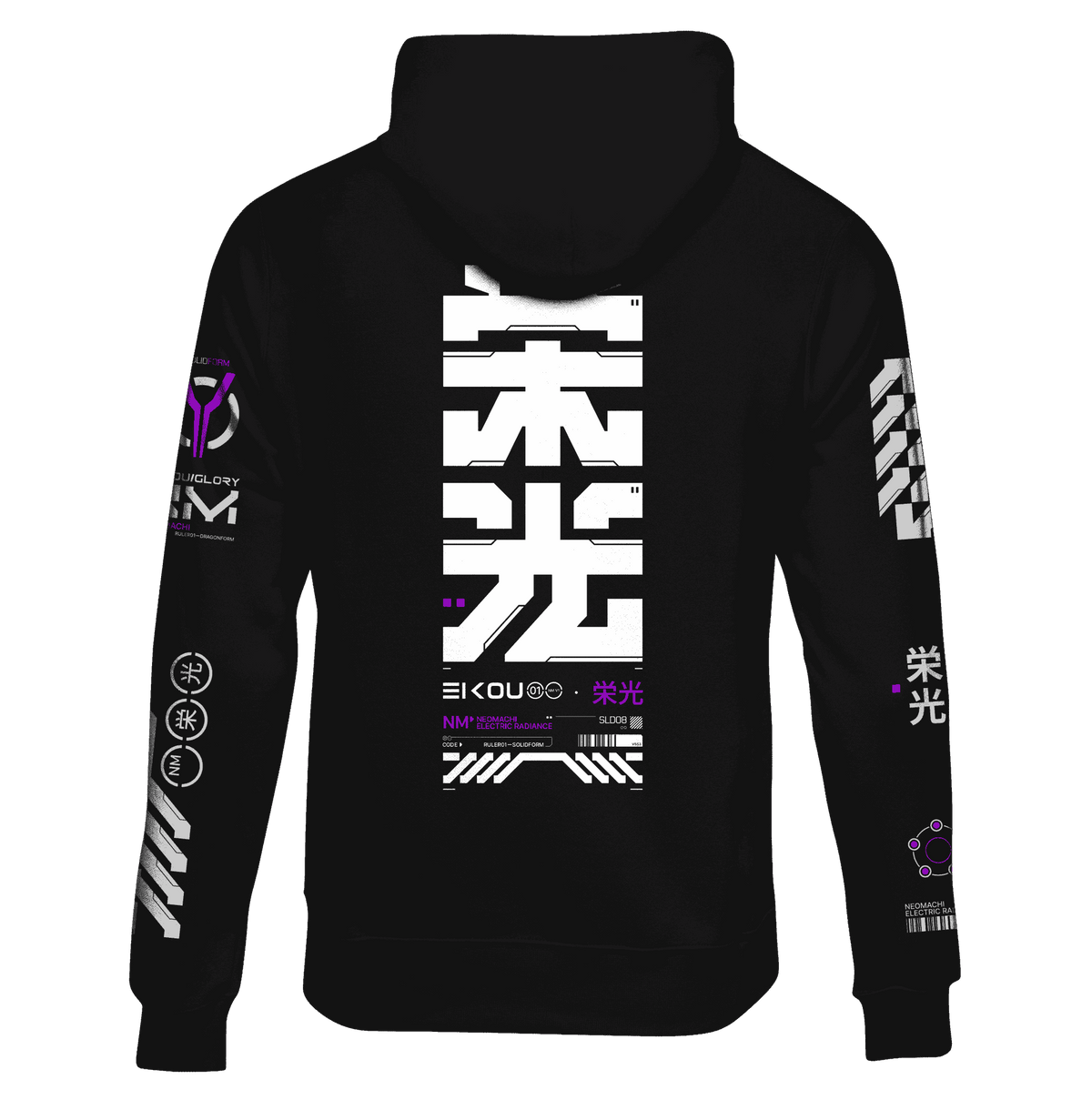
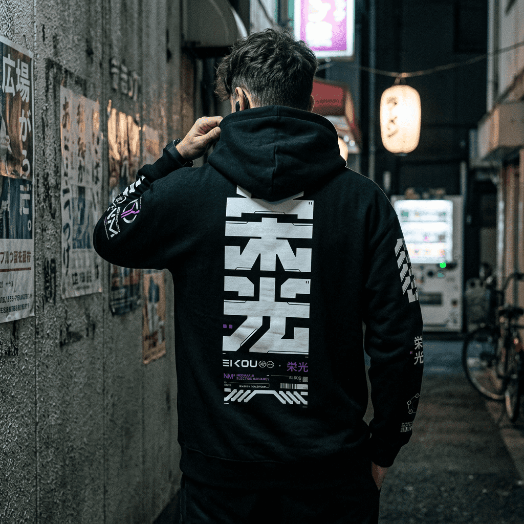
Palette: dark base — black, blue-black, charcoal — with one saturated accent, usually cyan or magenta. Roughly 80% darkness by area.
Mood: alert. Rain, density, surveillance, competence. Things work, but not for you.
Graphics: katakana and kanji, circuit traces, HUD fragments, fictional corporate marks, glitch artefacts.
In clothing: technical silhouettes — oversized hoods, bombers, tapered legs — with graphic density on top. See the complete guide to cyberpunk clothing.
Vaporwave: the future as nostalgia
Time signature: backwards. It is 1993 and someone is remembering it wrong.
Palette: pastel. Soft pink and pale cyan on white or washed-out lilac. Crucially light, where cyberpunk is dark — the two palettes are near-inversions of each other.
Mood: melancholy, ironic, slightly sedated. Empty shopping malls, hold music, plants in office lobbies.
Graphics: Roman busts, Windows 95 chrome, dolphins, palm trees, wireframe grids receding to a horizon, Japanese text used decoratively for atmosphere rather than meaning.
In clothing: lighter garments, softer prints, less technical shape. It is a mood applied to a normal t-shirt rather than a silhouette.
Y2K: the future as it was actually marketed
Time signature: the real years 1998–2004, not remembered ironically but revived enthusiastically.
Palette: silver, chrome, iridescent, bright primary blue, hot pink. Reflective and metallic rather than luminous.
Mood: optimistic and slightly ridiculous. Flip phones, translucent plastic, frosted electronics.
Graphics: lens flares, bubble typography, chrome text, star sparkles, low-poly 3D.
In clothing: shine and cut. Metallic fabrics, tiny sunglasses, low-rise everything, baby tees. Almost the opposite of the oversized cyberpunk silhouette.
The comparison table
| Cyberpunk | Vaporwave | Y2K | |
|---|---|---|---|
| Looking | Forward | Backward, ironically | Backward, sincerely |
| Base tone | Dark | Light / pastel | Bright / metallic |
| Emotion | Alert | Melancholy | Optimistic |
| Surface | Wet, matte, glossy mix | Flat, faded | Reflective, chrome |
| Silhouette | Oversized, tapered | Ordinary | Fitted, cropped |
| Typography | Katakana, technical | Kanji as decoration | Bubble, chrome |
| Wearable daily | Very | Very | Depends on your nerve |
Where they genuinely overlap
They are not unrelated, and the overlaps are why people confuse them.
- All three run on 1980s–90s Japan. Cyberpunk takes the city, vaporwave takes the consumer culture and the city pop, Y2K takes the consumer electronics.
- All three use neon and grids. But cyberpunk's neon is a light source in darkness, vaporwave's is a faded print, and Y2K's is a reflection.
- Synthwave and outrun sit between them. Sunset gradients, chrome text, wireframe horizons — genuinely a hybrid, which is why it is the hardest one to classify.
The one test that separates them
Ask what the image thinks about the future.
- Dread, but engaged — cyberpunk.
- Wistful about a future that never showed up — vaporwave.
- Excited, uncomplicated — Y2K.
Or, faster: look at the background. Cyberpunk's is dark. Vaporwave's is pale. Y2K's is white and shiny.
Can you mix them?
Cyberpunk and vaporwave, cautiously yes — a pastel accent against a dark technical outfit is unexpected and works, precisely because it inverts the expected palette. One pastel piece, everything else dark.
Cyberpunk and Y2K, harder. The silhouettes actively fight: cyberpunk wants volume on top and taper below, Y2K wants fitted and cropped. Pick a lane.
Whatever you combine, the one-hero-piece rule still applies. Mixing aesthetics is not permission to wear four loud things.
Frequently asked questions
What is the difference between cyberpunk and vaporwave?
Cyberpunk is dark, forward-looking and alert; vaporwave is pastel, backward-looking and melancholy. Their palettes are close to inversions of each other.
Is synthwave the same as vaporwave?
No. Synthwave is sincere 1980s revival — sunset gradients, chrome, driving music. Vaporwave is ironic 1990s consumer nostalgia. They look similar and mean different things.
Is Y2K fashion coming back?
It already did, and it is the most visible of the three in mainstream retail right now. Cyberpunk has stayed steadier over a much longer period because it is tied to an ongoing genre rather than to a single revival cycle.
Which aesthetic is easiest to wear day to day?
Cyberpunk, by some distance — because it is built on a dark neutral base, most of the outfit is clothing you would wear anyway.
Where can I buy cyberpunk and vaporwave clothing?
NEOMACHI has designed in this space since 2020, with original artwork by real artists printed in Europe. Browse all cyberpunk clothing or the newest drops.
Pick your future
We are firmly in the dark-and-forward-looking camp, with the occasional pastel accent when a design earns it.
Shop all cyberpunk clothing → | Techwear vs cyberpunk vs darkwear →