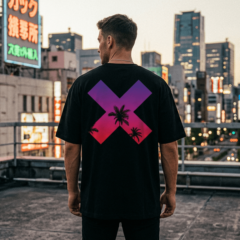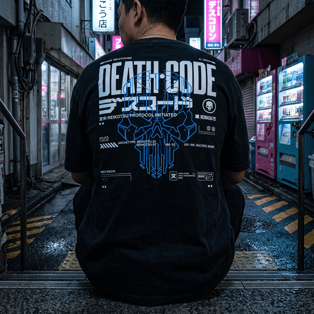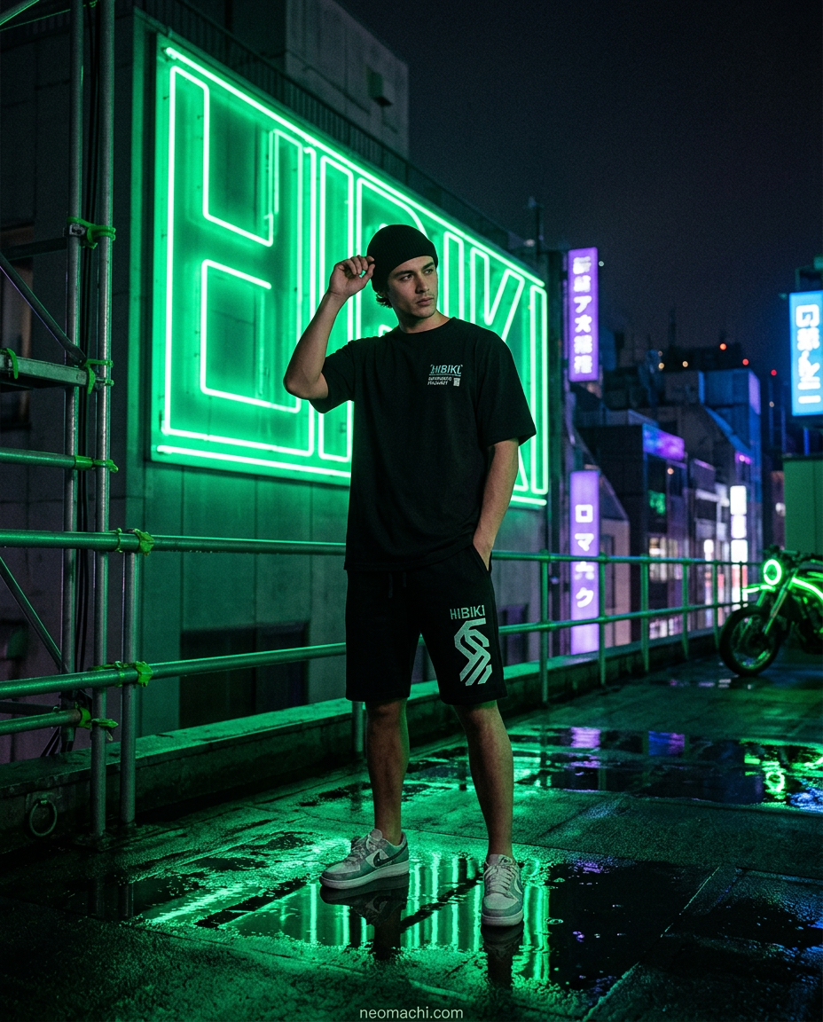
Every cyberpunk image you have ever loved runs on the same three ingredients: a very dark field, one or two saturated lights, and wet surfaces to smear them across. Change any one of those and the effect collapses.
This is why the palette is so consistent across forty years of film, games and clothing, and why "just add neon" produces something that looks like a sports drink advert rather than Blade Runner. Here is what is actually going on, and how to use it when you get dressed.
The rule: darkness is the ingredient, not the absence of one
Neon does not glow. Neon appears to glow because of what surrounds it.
A cyan sign at midday is a pale blue rectangle. The same sign at 2am against wet black asphalt is a light source. Nothing about the sign changed; the field around it did. Human vision judges brightness by comparison, not absolutely, so the darker the surround, the more a bright colour reads as emitting rather than reflecting.
Applied to clothing, this gives you a ratio that actually works: roughly 80% dark, 20% accent. Go past that and the accent stops being a light source and becomes a colour block.
This is the mechanical reason behind the styling rules in how to dress cyberpunk without looking like you are in costume. It is not aesthetic preference. It is how eyes work.
The dark half: not all blacks are the same
The most common mistake in an all-dark outfit is using one flat black everywhere. It reads as a silhouette rather than as clothing.
Cinematographers solve this by keeping the shadows slightly coloured. Cyberpunk films almost never use pure neutral black in the shadows. They sit somewhere in deep blue-black or a cool charcoal, which keeps the image readable and stops the frame going dead.
Do the same across an outfit:
- Deep blue-black. Reads as night, night rain, distance. The most cinematic dark.
- Charcoal / concrete grey. Reads as architecture, infrastructure, the city itself.
- True black. Reads as void. Use it as the anchor, not the whole outfit.
Three visibly different darks in one outfit (a charcoal hoodie, black tapered joggers, a deep navy jacket) has depth. Three identical blacks has none.
The bright half: why cyan and magenta specifically
The two dominant cyberpunk accents are not arbitrary.
Cyan and magenta are near-complementary opposites on the perceptual colour wheel. Placed side by side they produce maximum vibration: the edge between them appears to shimmer. That instability is doing a lot of the emotional work in the aesthetic. It is uncomfortable, electric, slightly wrong.
They also come with genuine historical baggage. Cyan-magenta is the visual signature of 1980s neon tubing and early CRT phosphor, and the entire canon (Blade Runner, Akira, Ghost in the Shell) was shot or drawn in a world lit that way. The palette is a memory of a specific decade's technology. Where that canon came from is in why cyberpunk is Japanese.
The rest of the accent family
- Acid / toxic green. Terminal phosphor, code, contamination. Reads more hacker than street.
- Hazard orange and yellow. Industrial signage, warning tape. Reads utilitarian and grounded, and is the most wearable accent by daylight.
- Blood red. Alarm states, faction markings, danger. Extremely strong; use in very small quantities.
- Sodium amber. Old street lighting. The warm, melancholy end of the palette, nostalgic rather than futuristic.
Pick one accent. One.
The single most common failure in cyberpunk outfits is two or three accent colours at once.
The reason it fails is the same reason the palette works in the first place. Contrast is a comparison, and a comparison needs exactly one thing to compare against the field. Cyan plus magenta plus green in one outfit means nothing is the brightest thing. The eye has nowhere to land, and the effect flattens into noise.
Screenshots of games and films look like they use many colours. Freeze a frame and count: almost always one dominant hue with a single secondary sitting far in the background.
Wet surfaces, or: why texture matters
The other half of the cyberpunk look is not colour at all. It is specularity: the way light behaves on wet, glossy or reflective surfaces. Rain-slick streets, glass, plastic, chrome. Those surfaces turn one light source into twenty, which is what fills the frame.
You can borrow this in fabric choice. Matte cotton absorbs light; a technical shell, a coated windbreaker or a satin-lined bomber throws highlights. Mixing one reflective layer over matte layers gives an outfit the same depth a wet street gives a shot. Which outerwear shape does what is in the cyberpunk jackets guide.
This is also why chunky, technical-looking footwear works so well: multiple materials, multiple gloss levels, multiple highlights.
Three palettes that work
Neo-Tokyo night
Blue-black base, single cyan accent, one reflective layer. The canonical version. Cool, cinematic, works in every light.
Street level
Charcoal and concrete grey, hazard orange accent, all matte. Grittier, more utilitarian, and the most wearable by daylight: orange on grey reads as workwear rather than costume.
Terminal
True black throughout, acid green accent, minimal print. Quiet and specific. The version that works in an office.
Applying it without buying anything new
- Audit your darks. Are your dark pieces actually different from each other, or all the same flat black?
- Count your accents. More than one bright colour? Remove one.
- Add one gloss. A single reflective or coated layer over matte ones adds more depth than another graphic will.
- Put the accent high. Near the face (hood, collar, chest, a beanie) is where it does the most work.
Frequently asked questions
What colours are cyberpunk?
A dark base (black, blue-black, charcoal) with one saturated accent, most often cyan or magenta, sometimes acid green, hazard orange or blood red. The ratio matters more than the specific hue.
Why are cyan and magenta so common in cyberpunk?
They sit near-opposite each other perceptually, producing maximum contrast and a shimmering edge where they meet, and they are the authentic colours of 1980s neon tubing and CRT displays, the technology the genre grew up around.
Can a cyberpunk outfit use warm colours?
Yes. Sodium amber and hazard orange are both canonical and both easier to wear in daylight than cyan. They read nostalgic and industrial rather than digital.
Do I have to wear black?
You need a dark, low-saturation majority. Deep navy, charcoal and dark olive all work. What you cannot do is make the bright colour the majority. That is when the effect disappears.
See it applied
Our designs are built on exactly these rules: dark bodies, disciplined accents, artwork drawn by real artists rather than generated. Browse the full range, read ten outfit formulas that put the palette to work, or start with the complete guide to cyberpunk clothing.