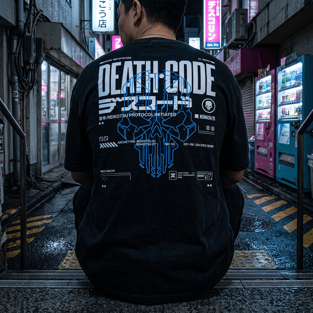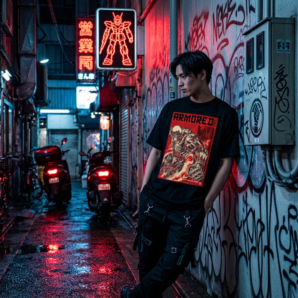
Cyberpunk was largely written by American and Canadian authors, filmed by British and American directors, and set in cities that mostly do not exist. So why does almost every image of it look like Tokyo? Why is "Japanese cyberpunk" the version people picture, even when the story is set in Los Angeles?
The short answer
Because the genre took its visual shape in a very narrow window, roughly 1982 to 1988, that sat exactly on top of Japan's economic boom. Western writers and production designers who wanted to show a future run by corporations and consumer electronics did not need to invent one; they could photograph Shinjuku. William Gibson put it most bluntly, writing in Time in 2001: "Modern Japan simply was cyberpunk." Japanese creators then took the borrowed images back and did something deeper with them, and the two traditions have been feeding each other for four decades. That is why Japanese cyberpunk is not a sub-genre. It is the genre's default setting.
1980s Japan and the future that Western writers imagined
The founding works arrived almost together: Blade Runner in 1982, Neuromancer in 1984, the Akira manga from 1982 and its film in 1988. All of them were made while Japan was simultaneously the most technologically advanced and the most rapidly changing place a Western observer could point to. Sony, Nintendo and the Walkman were the future you could hold; Tokyo's skyline was the future you could walk through.
Blade Runner's Los Angeles is Tokyo and Hong Kong with the labels changed: the signage, the density, the street food, the rain. Gibson has said repeatedly that he assembled Neuromancer's Chiba City and the Sprawl largely from what he was seeing of Japan at the time. The genre's default city was Japanese from the first frame, before a single Japanese creator had touched it.
Akira, Ghost in the Shell and the visual grammar
Then Japan took it back. Katsuhiro Otomo's Akira (manga from 1982, film 1988) gave the genre Neo-Tokyo, the megacity rebuilt on the ruins of the old one, and a visual density no Western production could afford to draw. Masamune Shirow's Ghost in the Shell (manga 1989, Mamoru Oshii's film 1995) took the question of the body and the networked self further than the novels had. Serial Experiments Lain and Texhnolyze followed in the late 1990s and early 2000s.
None of these are imitations of Blade Runner. They have different preoccupations: identity, networks, what happens to a self that can be copied. The visual language went out to the West as a set of photographs and came back as a fully developed grammar. We cover the individual works in the anime that built the cyberpunk aesthetic; the point here is that the round trip is why the look feels coherent rather than borrowed.
Neon, kanji and density: how Tokyo became the template
Signage density
Japanese urban signage stacks vertically because the writing system allows it, which produces walls of illuminated text several storeys high. Nothing in Western cities looks like that. It is the single most recognisable cyberpunk image, and it is a direct consequence of how kanji and katakana are written.
Technology on top of old architecture
Tokyo rebuilt fast and layered rather than replaced. Cabling runs overhead. New buildings press against old ones. Vending machines glow in residential alleys. That unevenness, the future arriving in patches rather than all at once, is the genre's core visual idea, and it was observed, not invented.
Neon as ambient light
In most cities lit signage decorates streets that are lit by streetlights. In 1980s Tokyo entertainment districts it was effectively the primary light source, so everything was lit in saturated colour from several directions at once. That is the lighting condition the entire cyberpunk colour palette imitates.
Density as normal
Crowds in cyberpunk are not a crisis; they are the background. That reading of the city as busy but functional, rather than dystopian because crowded, comes from Tokyo, not from Western science fiction's usual anxiety about cities.
From Akira to Neo-Tokyo streetwear
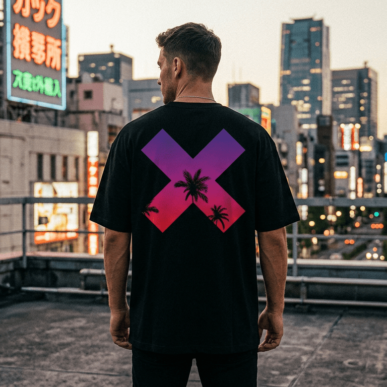
Cyberpunk clothing inherits all of this directly, which is why it looks Japanese even when the brand is not.
- Typography as graphic. Katakana and kanji appear on cyberpunk garments because they appear on the buildings in every reference image. The angular, high-contrast forms of katakana in particular work extremely well as a graphic element. What the characters on a given design actually say is covered in cyberpunk graphics explained.
- Faction and corporate marks. The fictional-corporation logo comes from the same source: a cityscape where every surface carries a brand.
- Layering and proportion. Japanese street style has run more layered and more volumetric than Western streetwear for decades. The oversized top over a tapered bottom that cyberpunk depends on comes from Harajuku and Shibuya, not from technical outdoor clothing.
- Restraint. The discipline of a mostly black outfit with one strange element is a Japanese design instinct, and it is what separates good cyberpunk clothing from costume.
That lineage is the reason our own designs are built around Japanese figures and Japanese type: samurai, oni, kitsune, kaiju, kanji drawn to mean something. The complete guide to cyberpunk clothing shows how those pieces combine into an outfit; the t-shirts and hoodies are where the type and the figures live.
Using the influence honestly
There is a version of this that goes badly: random kanji chosen for shape rather than meaning, a mascot with no connection to anything, "Japanese-looking" applied as a filter. The distinction we hold ourselves to is whether the reference means something.
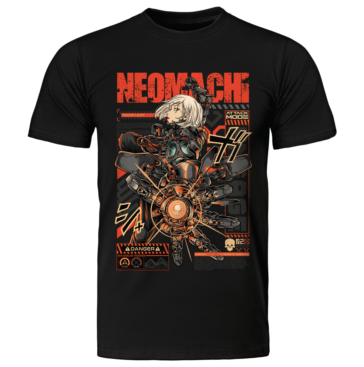
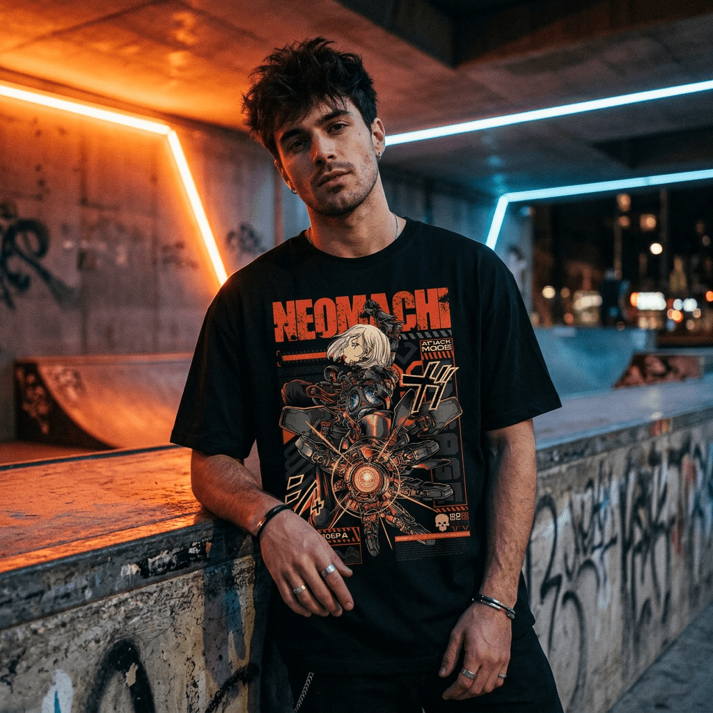
NEOMACHI is a compound: neo for new, machi (町) for town or district. A new district. We build designs as if they came from somewhere in it, a faction, a corporation, a street. That is the whole reason the brand has a name rather than a logo. When you are assessing any brand in this space, that is a useful test: does the Japanese element carry meaning, or is it a texture? It sits alongside the other tests for telling real cyberpunk brands from storefronts.
Want the street-style side of the story? Our Japanese streetwear guide covers Ura-Harajuku, the brands that started it and how to wear it today.
Frequently asked questions
Why is cyberpunk Japanese?
Because the genre took visual shape in the 1980s, at the height of Japan's economic boom, when Tokyo was the most convincing available image of a high-technology urban future. Blade Runner and Neuromancer both drew heavily on it, and Japanese creators, Otomo and Shirow above all, then developed the genre further than its Western originators had.
Is cyberpunk from Japan?
Both Japan and North America, honestly. The literature is largely North American; the visual language is largely Japanese; the two have been feeding each other since the early 1980s. Neither half makes sense without the other.
What is Japanese cyberpunk fashion?
Streetwear that carries the genre's Tokyo inheritance: katakana and kanji as graphics, faction and corporate marks, layered and volumetric proportions, mostly black with one deliberate element. Done well, the Japanese references mean something. Done badly, they are decoration.
What does "Neomachi" mean?
Neo (new) plus machi (町, town or district): a new district. The brand is built as a place, which is why the designs read as if they come from somewhere.
See the result
Designs drawn by real artists out of this specific lineage, printed in Europe on organic cotton, worn by 30,000+ customers.